Tuesday, 25 June 2013

Latest Exhibition News

LATEST NEWS - One of Ashley's new paintings 'City of Glass 11- StillmanStillman' has been selected for the 2013 Ludlow Open


Ashley latest solo exhibition  opens on Friday 5th July at the Plough Arts Centre in Devon. He will showing his 'City of Glass' series including new paintings completed during his residency at Bodmin's Shire Hall.

Ashley comments about the series, 'After years of struggling for ideas for a painting about New York, a place so iconic, so filmed, painted and written about, I found a way in with 'The New York Trilogy', Paul Auster's deconstruction and reinvention of the detective novel. As a visual artist, I can relate to Paul Auster's layerings of reality and identity and his explorations of chance. The paintings are a complex mix of fact and fiction, manipulations of the different realities of information and imagination.'


To coincide with the exhibition Ashley will be giving a talk on Friday19 July at 7pm about the inspiration, ideas and the making of the series and his journeys around the USA. Cost £5 including wine and nibbles.
 
Colour & Coast Workshop
If you would like another opportunity to work with Ashley, he will be hosting his popular 'Colour & Coast ' 1 day workshop at The Plough on Friday 19 July 10am - 4.30pm. Cost £35.
Using the coastal theme, Ashley will be sharing many of his tips and techniques of how to use colour imaginatively and effectively. All levels and abilities are welcome.
To book either the talk or the workshop, please call the Plough Box Office on 01805 624624
 
 
The Gloss Gallery, Exeter   5 July - 24 August 2013,

PREVIEW: Thurs 4 Jul 6-9pm


Also coming up is an exhibition of Ashley's Cornish paintings including the Porthleven series at The Gloss Gallery, Exeter, Devon. Ashley is very pleased to be given the front room to show case his work. The room has superb light - thanks Lucinda.

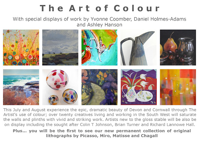
Alongside 'The Art of Colour' is an exhibition of work by the Devon Artist Network, which includes work by one of our favourite artists Sara Bor.

We hope you can come along to one of the Previews or even both!


Canterbury 'Freedom in Painting with the Life-Model' Workshop


Shona McGovern

Thank-you to all who attended Ashley's recent workshop at Canterbury Christchurch University. We had another full house and everyone rose to the challenges set by Ashley (as this was no regular life-drawing/painting workshop). By the end of day 2 there was some really exciting work made. A BIG thank-you must go out also to our model Sharon Smithers, who was fantastic.


Anne Marie Lepretre


L to R, 1-2 Yvonne McCann, Kathy Rudman & Terri Leigh


Some Comments About the Workshop
 
'A lively and fun course, thank-you Ashley, most enjoyable. rekindles enthusiasm every time. Fab Shaz' (refers to our model Sharon Smither's)
 
Tanya Remon
 
'Ashley is always so generous with his time and knowledge he is a refreshing and inspiring tutor.'

Shona McGovern
 
'This is the 3rd workshop I have participated in and I always learn something new and feel that my painting is improving each time. Thank-you.'
 
Catriona Campbell


Saturday, 8 June 2013

'City of Glass 12 - W107St,E69St' 150x120cms

'City of Glass 12 - E107St,W69St'     150 x 120cms

Went deeper & deeper into the painting today and found my answers.  The orange is immense. You might want to play at 'spot the difference' with the painting in last nights blog. 
 
I was painting in my sleep and went into the studio with a bunch of ideas. Firstly, I felt the left side of Manhattan was too soft, not tough enough. The drawing was strengthened by filling, with flatter paint ,the lovely shape of the Hudson River between the left side of Manhattan and the left edge of the canvas. I found a green that set off the orange/reds. A warmer green line was added to the edge, running in parallel to the now straighter line of the West Side and connecting to the vertical drips of the avenues.   I'm still looking for more, for something else- I realised that the grid of Manhattan needed a horizontal or two to break up the verticals so I introduced W107St and E69St, the green lines flanking Central Park and the streets where author/detective Quinn and his client live.

Already, there was a subtle scaling up of the street grid on the right side of the painting, so taking the main horizontal as E69St, I introduced the image of a tiny ziggurat-roofed apartment building, 3 dimensional not flat, so I could repeat the angle of the lower West Side of Manhattan.  The building went in and went out: all the painting needed was the tiny angle.


Friday, 7 June 2013

'City of Glass 12' 150 x 120cms

Friday 5pm
 
Janie told me about a thing on TV- 'What do artists do all day?' My 7 hrs today were spent moving the painting from below to above. Forwards? Buildings and figures went in and went out - they complicated and cramped the space.   I enjoyed the freeing-up of Manhattan and the emergence of emptiness. With that came the refinement of proportion and the very special bottom right corner.  But it all seems very familiar- does this piece need more? It still may be the left half of a larger piece - we'll see tomorrow.
 
I still feel there is a painting somewhere that links my last 2 StillmanStillman paintings with the  other paintings in the series, a painting that contains the Manhattan shape and the figure of Stillman.
The obvious problem is that if you put the two side by side, the figure becomes a giant, which I don't want: it is the Tower of Babel that is giant. One solution was to make the Manhattan shape a painting of Manhattan (reference to Matisse's Red Studio) with the figure of Stillman disappearing behind.   Another idea was have the Manhattan shape on the extreme left, and the figure on the extreme right of a very large painting which was why I rushed home for a second canvas on Thursday.  The idea was to have the Manhattan shape and the figure the same size but to make the figure appear smaller by  gradually scaling up the grid of the streets as you move from left to right. 
 
At the end of the day I put one of the Stillman canvases alongside the this painting and saw that the paintings are linked: they both are shapes in colour, connected by the paint handling, composition and the subtle horizontals.  And of course the shape and proportions of the Manhattan shape suggest the human-figure.
 
  
Thursday 5pm


Monday, 3 June 2013

'City of Glass 11-StillmanStillman'

'City of Glass 11-StillmanStillman'

Today, with this piece, I have been reminded  'what painting is, what it can be, the possibilities in painting.......', words I use whenever I teach.  As the two canvases were not working together, I separated them- during the day the gap became wider and wider....... The canvas with the red figure had no New York context- the grid of the streets was imposed time and time again , blatantly and subtly, horizontal, vertical, avenue, cross-street, none right but each contributing and enriching the paint, colour and surface. 
 
As artists, we should never be passive with the world we see - we have to do something with it.  We should be ambitious for our piece, and strive for something new, something we have never done before or seen before: the trick is to recognise that 'different' thing, however you get there, whether by chance or design or hard slog. This is the excitement we crave.
 
Many thanks to Janie M McDonald, my fellow artist in the Shire Hall studio. For a couple of days she had been questioning my 'brown' figure - (I was being too literal, one of the Stillman's in the novel has a brown overcoat). Janie remembered the 'blood-reds', I used in our last two stints together at the Shire Hall. But she was also strongly suggesting reversing the canvases as I did in the last painting but all I could see was rutting stags and dilution of the idea behind the painting.
 
But bloody hell.............
 
The painting is more about the idea and the centre-line more powerful, with this criss-crossing of the figures and glorious ambiguities and tension about who is in front of who. The figures are fighting for the space - but it is not a space 'out there'. It is a painting space, an ambiguous space, so difficult to find with the human-figure......The painting now has the clarity of last Friday, but with much more. The New York context is there, with the horizontal green band of Central Park and Columbus Circle.
 
I'll be starting a new painting tomorrow with the same idea of the two Stillmans, but on a single large canvas so there is no option of switching the canvases. I'll have to find my elusive, ambiguous space within the canvas...figures jammed up against the Manhattan shape, perhaps....


Saturday, 1 June 2013

'City of Glass 11- StillmanStillman' Work in progress


Saturday
 

Like 'City of Glass 10-StillmanStillman' this painting explores the idea of the detective Quinn's dilemma about which Stillman to follow: one goes left, one goes right.  The split canvas represents the choice.  The viewer becomes Quinn, flitting from figure to figure, forced to choose......
 
My only niggle about 'City of Glass 10' was the absence of location and its disconnection
to the other paintings in the series. I thought that instead of forcing location onto that painting,  if I did another painting that included the two figures and location, the link would be made. On reflection, the painting was resolved on Friday (see below). Midtown Manhattan,(where Grand Central is located) is suggested, with the Hudson River indicated by the two parallel lines behind the blue figure and the east river by the thick band of grey behind the brown figure.
 
Today, I tried to make the location more explicit and introduced the lime-green horizontal to indicate the bottom of Central Park, with the canvas divide as 5th Ave. I also introduced a grid which confused the painting even more.  Lots of problems with the right -figure: either too graphic or too subtle or too heavy or too brown! It disappeared altogether at one point which confirmed to me it needed to be there. Had a good last half-hour when the right figure was scraped back to near-bare canvas.
 
I agree with Janie's comment today, that the left painting works on its own. Splitting the canvases is an option but may make the idea weaker. Perhaps a small gap might work. While it works in the left canvas, the green band doesn't help the diptych - I'll try a new colour on Monday and extend it into the right side or even take it out. The band weakens the power of the divide.   Need some clean brushes first!! 
 
 
Friday