Thursday, 21 April 2016

Freedom in Painting in Porthleven with Ashley Hanson

Sat 21- Fri 27 May & Sun 2- Sat 8 October 2016

Bruce Campbell  on April 2015 'Freedom in Painting in Porthleven' Course

5 Day Course in & Additional Exhibition Day £375

This course is a unique opportunity to work in a small group with acclaimed colourist and landscape artist Ashley Hanson, a member of the Newlyn Society of Artists. The studio for the week is in the Old Lifeboat House, in Porthleven, Cornwall, dramatically positioned on the edge of the harbour facing the open sea. Ashley has a very special connection with Porthleven; the paintings of Peter Lanyon (in particular 'Porthleven ' made in 1951) have had a major influence on his work  and this unspoilt fishing town with it's double harbour and iconic clock tower continues to inspire his paintings.


Porthleven 23 - Ashley Hanson

"Image, structure, movement, all the ingredients are here to make paintings. This workshop is an opportunity for artists to explore and respond to it's richness, rawness and complexity. It's a special place for me, - so far there are 24 in the series and each time I revisit there is an abundance of ideas for more."

During the workshop Ashley will inspire and encourage participating artists to produce their own personal interpretation of Porthleven, adding to its rich tradition.


The Old Lifeboat House - Our Studio

Working inside the studio


On the afternoon before the course starts artists have the opportunity to set up their studio space and meet the rest of the group. This is followed by four and a half intense working days in the studio and around the harbour. The group will then help transform the studio into an exhibition space on the afternoon of the fifth day, ready for the Private View later on that evening. The exhibition will continue through to the following day giving the artists an opportunity to show and sell their work.


Course Information


Antonia Glynne- Jones working outside 
Group drawing exercises with Ashley by the harbour


The first morning is spent getting to know Porthleven.  Everyone will be encouraged to make studies  around the harbour, collecting information and ideas for paintings back in the studio. There will be plenty more opportunities for further studies in and around Porthleven during the week.


Jane Crane's drawing and study

On the course there will be a mixture of group exercises, demonstrations and discussions to help artists engage with their paintings and take it somewhere new. Colour , mark-making, space and composition are all areas that will be explored and there will be plenty of opportunity for one to one tuition and mentoring with Ashley.

Ashley mentoring Mitzi Delnevo

Ashley's Painting -  'Porthleven 20'
Ashley will also be working on his own Porthleven painting and using this as a teaching tool to demonstrate techniques and ideas.Our previous groups have found this  an invaluable way to build on their existing knowledge and pick up further tips. At the end of the week the group will get the chance to discuss all the work made in a group critique.


The course is designed for painters who wish to enhance their creativity and look towards abstraction and beyond the representational. Ashley looks forward to sharing his wide knowledge and passion for colour, landscape and oil/acrylic painting with the group.


Erica Shipley's Painting
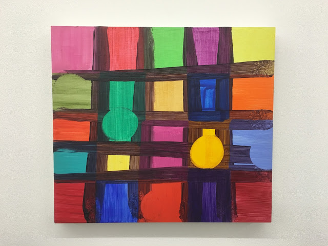
Bruce Campbell's Painting


Diane Bedser's Painting

Mitzi Delnevo's Painting
Jo Rollnick's Painting


Your Tutor


Ashley has over 30 years experience as a professional artist and this combined with his teaching as a Visiting Lecturer at Canterbury Christchurch University and the National Academy of Art Bergen, Norway ensures the teaching you will receive throughout the course will be of the highest level. In addition he has run many popular and successful workshops of his own around the UK.

Ashley's paintings has been shown nationally and internationally. His work has been selected for the Royal Academy Summer Exhibition, the Discerning Eye and the National Open Art Competition. Last year he was short listed for the Connect2Colour Art Prize at Lacey Contemporary Gallery in London and he has been a recipient of a Boise Travel Scholarship from the Slade School of Art and is a former prizewinner of the Hunting Art Prizes.


Accommodation


Porthleven is well equipped with a variety of accommodation options, excellent restaurants and pubs within easy walking distance of the studio.

Above Beach Cottages have a good selection of cottages and can arrange a Sunday to Sunday let on certain properties. Porthleven Holiday Cottages offer a 10% discount, if you advise them you are booking the course. They also have some excellent B& B accommodation in The Artist Loft and once again a 10% discount is available to participants on the course. See also http://www.porthleven-online.com for alternative B& B's and accommodation available.

To Book


Email denise@ashleyhanson.co.uk or call 01208 77656. As their are only 7 places available on each course, early booking is recommended. To secure your place a £70 deposit is required at the time of booking and the balance is due 8 weeks prior to the start of the course.

You can view a write up of some of our previous Porthleven courses here:
October 2015   April 2015
October 2014   April 2014  April 2013

For a further insight into Ashley's art see www.ashleyhanson.co.uk and the blog http://ashleyhansonart.blogspot.co.uk


Ashley with Jane McClement
Our Freedom in Painting courses continue to challenge artists of all levels of all abilities, with many artists returning year after year. Participants often finding they continue to benefit from the tuition and experience long after the course.


Quoted from February 2013 edition of 'The Artist' magazine by editor Dr Sally Bulgin


"Ashley's concern as an artist and teacher, is to unleash the emotional response to the subject matter that enables the painter to take risks, discover a 'personal colour palette that excites' and to provide the fresh vision of Britain's natural beauty that places him within the long tradition set by the masters of the landscape genre."

Testimonials


My third year in  Porthleven and I build on my experiences and art practice. Ashley and Denise give 110% each time - I don't know of other courses where the tutor is as committed as Ashley. His ability to communicate his knowledge and ideas is a great skill.
Jane McClement - October 2015

Ashley has the talent of seeing possibility in everyone's paintings and leaving people empowered.
Bruce Campbell - April 2015

Ashley is a very fine and energetic tutor - plenty of ideas. He sees things in our work that even we don't see! I have been much encouraged and inspired!
Joy Viegas - October 2014

Enjoyed the company and Porthleven which I came to adore. Ashley was the perfect host, artist and tutor! 
Alison Garner - October 2013


Monday, 4 April 2016

A Strange Occurrence - Two Artists, Two Continents....


'Shiro'   Paul Behnke   32x30ins  acrylic on canvas  2016


'City of Glass 55 - (A)'    Ashley Hanson   25x30cms  oil on canvas  2016

When I posted this painting on Facebook recently, as a 'brick' in my recent City of Glass 38- (T.H.E.T.O.W.E.R.O.F.B.A.B.E.L.)', there was A Strange Occurence. After posting,a split-second later appeared this painting by New York artist Paul Behnke. with the uncanny similarity of the triangles. A further co-incidence was that when I made my piece,  I'm sure I had been thinking about a Mali Morris painting that Paul had recently seen in Cuts, Shapes, Breaks and Scrapes, at Seventeen in London and posted on his Blog 'Structure and Imagery'


'And Ashbery'   Mali Morris   24x28cms   acylic on wood panel  2013

Seeing the paintings side by side made me think about our different approaches to painting and colour. In my work, I am happier with a context, my excursions into 'pure' abstraction proving to be a dead-end. The whole 'City of Glass' series is of course inspired by Paul Auster's novel 'The New York Trilogy' and in this painting the parameters were the the size and orientation of  the canvas, a possible connection to the grid of Manhattan, and a choice of 'T' or 'A', the two remaining letters. That is where my triangle came from but the context goes hand in hand with formal considerations during the process. 

I asked Paul about his triangle:

'For my part I'm not concerned with triangles as a form to work with. They come about more as a result of the process and a by product of the overall form I'm depicting. They are stylised elements within and part of that form'


I'm a great admirer of Paul's painting, the grandeur of their design and the scintillating colour.  Again with colour, we have different approaches. In my own work, I am puritanical about the importance of mixing colour, finding colour. I asked Paul about his colour: 'what does colour mean to you? purely formal and instinctive? did I read somewhere that you prefer not to mix colour?'

'Yes, generally I don't mix. only rarely when I need something quick that I can't buy. I think color is all of that even in the same painting. Parts of a form's color can seem formal but color has the capacity to convey an over all mood. Since I have no color choices in mind when I start a piece a color choice is a reaction to a color previously applied - just like painting in general - I make a move then react for or against that move’

With different philosophies behind our art, it is how we use colour that provides the link, its criticality to the piece, sensually and formally, and our searching for those magical colour- relationships, each colour leading to the next....


'City of Glass 38 - (T.H.E.T.O.W.E.R.O.F.B.A.B.E.L.)'  Ashley Hanson 125x150cms 2016


Appropriately, Paul's painting 'Shiro' is part of the IF COLOUR COULD KILL - New Painting from New York City exhibition, curated by Jeff Frederick, at the Salena Gallery, Long Island University, Brooklyn, New York which opens 5 April until 29 April:

'Abstract painting is a color delivery device. But when does color become dangerous, even homicidal? If Color Could Kill imagines a world better than the one we live in: one where color is power. The works of these eight painters say Yes in a way that is louder than everyday life. Modern pigments free the painter from the boring colors of nature. This is color too strong to be safely observed by the naked eye, color so intense it overwhelms and electrifies our fragile, vulnerable humanity'  


Paul's work can also be seen in 'Drishti: A Concentrated Gaze' at 1285 Avenue of the Americas Gallery, New York.  April 11 - July 1, 2016.

Sunday, 13 March 2016

'City of Glass 38 - (I know who I am)'

'City of Glass' 41- (I know who I am)'  113x77cms

SEPTEMBER

This painting now has a new City of Glass number- 38

WEDNESDAY 16 MARCH

I have sat in my chair for an hour, looking and enjoying this piece. There is already a soft, subtle curve to the right of the rose line- there is no need to embellish. This paintings' links to the novel may be obscure, but after the (deliberate) claustrophobia of the last two paintings in the series, it represents a state of mind, a renewal..it's a good place to be. It's done.

TUESDAY 12 MARCH

An online dialogue about the painting with the Freedom in Painting Group helped clarify my thoughts on the title.  
A tale of obsession has become my obsession (in a good way)

SUNDAY13 MARCH

This is more like it...much more exciting...it's a space, a place (of escape)....the horizontals now all doing a job for the painting, the canvas-divide critical, the rose vertical - a signature- holding it all together. A grid has emerged not forced, open...the Ying/Yang of the two circles, one colour, one outline, contributing incident, difference, movement... This piece looks different yet looks like one of my paintings. I am not interested in straight image anymore or jack-off gesturing - painting is deeper...there must be an edge,,a question..

I have been watching 'True Detective' again. A line springs to mind from Rust Cohle- (yet another fictional detective) - who has a very dark perspective on 'being' but has no time for posturing, hypocrisy, compromise, bullshit.... 'I know who I am'

This line could make a good title. in terms of the novel, it references Quinn's state of mind and freedom(?) when he finally leaves the 'locked-room' of the apartment on E69th St.

'The Locked Room' is the title of the third story in the Trilogy*. It is also the title of Episode 3 in 'True Detective'. It is also how I perceive the studio, where an artist must be alone with his/her thoughts and the piece. 

I may simply call it 'Grid'.


p.m.

SAT 12  MARCH  p.m.

I'm in a painting.

It's gone backwards since this morning  A loss of purity and spaciousness, I've been looking at the idea of messing with scale: a book on end casting a shadow, suggesting architecture, landscape or tabletop? Echoes of Morandi's monumental still-lives.,,just a bad illustration. The figure is going back in on the right side, casting the shadow.....The paint needs scraping back on the left, it's too heavy, fade it out, build up heaviness on the right, take it to the edge of the canvas...The colour, tone, angle, execution, presence, of the yellow on the left side is much more interesting below. I was trying to be too clever- lining up the angle with the angle at the top of the shadow.Mistake. The horizontal plane needs to more subtle, maybe a line....
just like this morning..back and forth....exploring ideas....what is this painting?


a.m.


SAT 12 MARCH a.m.

Starting out with a word, 'Shadow' and it's dual meaning (a cast shadow and the verb-to shadow, to follow...), A familiar motif- the figure of Stillman - and the continuing, elusive objective of having Stillman and a building/tower in the same painting without the figure looking giant.

Just working out colours and composition, the placement and scale of the elements in the painting. A horizontal - introduced to counteract the powerful vertical of the central canvas divide- becomes a table-top and an idea emerges....

The central pillar suggests a book which I am going to move to the right-edge of the painting,
a more exciting,more extreme composition. The figure can go..for now. 

*'The New York Trilogy', a novel by Paul Auster.


Friday, 4 March 2016

'City of Glass 40 - (Coat of Paint)'


'City of Glass 40 - (Coat of Paint))'   60x30cms

SATURDAY

A change of title, a more intriguing title that references the physicality of this piece, the act of painting and Tom Waits' song, 'New Coat of Paint', from 'The Heart of Saturday Night' one of my favourite and most played albums in the studio.

FRIDAY

'City of Glass 40 - (Riverside Park)'

A colour-exercise (1), preparing for the 'RED' workshop in Canterbury, becomes a painting. If there is red there is green, hence the unplanned title. If you are familiar with the novel*, Stillman, (and of course Quinn who is tailing him), spends a lot of time wandering in Riverside Park. 

Following the method of 'City of Glass 39 - (STILLMANBABEL)', Stillman was 'built' over the armature of a wooden tower (of Babel). Once again the intention was to remove the tower during the process but stuff happens - I felt no need. Another bald Stillman- in (2) he has lost his head! Next time I'll give him some hair.


1


2
*'The New York Trilogy' by Paul Auster


Thursday, 3 March 2016

'Cape Cod & the Islands', 'Cape Cod', 'Nantucket'


'Cape Cod & the Islands'   60x80cms

At the midway point of my journeys around US on the Boise Travel Scholarship*, Denise came over for a couple of weeks and we drove to New England visiting Cape Cod, Nantucket and up the coast to Maine. After an aborted attempt to get a studio in New York, I took up the offer of working in the barn of sculptor Jon Isherwood in upstate New York. a great friend from Canterbury College of Art. The location was idyllic, with a view of the Catskills through the barn door. Jon and Helen were great hosts and critics too. An intense two months period of working followed, a critical period in my career. I was prolific, twenty odd paintings, including several large canvases. I worked in oils so had to return to the US a year later to build a crate around the paintings, before shipping them back to England.  My experiences in the US continued to inspire my work, becoming the 'A m e r i c a s c a p e s' series which was shown at the Woodlands Gallery, Morley Gallery and the Michael West Gallery.

'Cape Cod & the Islands' was shown at the Royal academy Summer Exhibition in 2011. Fall colours,...  boat-shaped Nantucket sails out of the painting....enjoying the range of paint, the journey from the flat wash in the top left through to the dense mass/weight of paint, colour, marks in the waters of Rhode Island. (below). Powerful in a different way is the second area of focus, the tiny pink tip of Cape Cod pulsating against the blue sea....the Atlantic shoreline is broken, water seeps into the land creating movement...

detail

Zooming in on Cape Cod in the next painting...love the colours of the water and the curved corner, echoing the shape of Cape Cod and the hook of Provincetown. The painting has an ambiguous space, the aerial viewpoint subverted by the receding scale of the boats, which help make Cape Cod almost vertical and sculptural. strangely anchored at the base.


'Cape Cod'   90x70cms

A colour-reversal in 'Nantucket': a mass of red-sea, perhaps influenced by Jon's barn where it was made. Colour and imagery are kept simple to highlight the amazing shape of the island- boat, sea-creature, moving through the water...


'Nantucket'   168x206cms


Two more favourite New England paintings from the 'Indian-Yellow' period! In 'New England', I particularly like the meandering outline of Maine against the lemon-sky (Canada). This painting has disappeared.

We never got to to Two Bush Island, I just liked the name. The painting is playful: location, image and the curious painter's space tucked behind the lighthouse. 


'New England'  60x50cms


'Two Bush Island Light, Maine'   25x35cms


* from the Slade School of Art

Friday, 26 February 2016

City of Glass 39 - (Prophecy)


'City of Glass 41 - (Prophecy)'  60x30cms

It's taken a while but we have a new title....

MONDAY
A few new touches that seem that seem to make the painting stronger. The orange line lifts the eye to the top of the painting: there was a nagging suspicion that the tower had to be higher - no need for that now. The orange line slightly squeezes the space between the top of the painting and the head and draws attention away from the head which I think works. I've also tidied up the top of the tower making it sharper, stronger and the paint around the bottom left of the overcoat which was getting a bit murky. Touch of orange in the brown too. Fiddled a bit with the hand that looks like a club in image below! The title still not definite..I may know more when I've finished the second one..

SATURDAY PM
I took out a heavy brushmark from the bottom left of the coat and refined the shape of the tower by carving out the 'ziggurat' steps at the top. Much stronger now...there are traces, residues, marks of interest within the tower, not sure there is any need for the island....might have to change the title, perhaps 'Obsession' Thinking about putting thin horizontal band on the top edge to squeeze the space with the top of the head and also lift the tower. Or put in a spire/radio tower cutting thru the collar..we'll see...


'City of Glass 39 - (Prophecy)'   60x30cms


SATURDAY AM
I couldn't wait..the reveal...odd, exciting....just dealing with it at the moment... might take out the heavy outline, lose the figure a little or lose the blue or the figure entirely then re-draw the figure inside the tower...


FRIDAY
Stronger drawing- love the curve of the back- and better browns that are starting to do something with the blues. Denise and I are missing the grey. I've run out of quick-dry medium so shall have to wait longer before the tower is removed. I have a same size canvas- lets do another one. This is quite a small piece- 60x30cms- perhaps i need to do one life-size...the purity of the early version (1) is still my favourite..


3


THURS
The 'City of Glass' series*, is dominated by three elements:the Tower of Babel, the island-shape of Manhattan and the figure of Stillman. Several of the paintings include two of the three elements, the idea behind this piece is to include all three. 

I started off with a straightforward representation of the familiar motif of Stillman. I was thinking about the sequence of 'Weeping Woman' paintings in the Edvard Munch exhibition at Tate Modern a couple of years ago, with the bowed head almost crushed by the low ceiling. Its' literalness was disrupted by smudge and disguise and a pour of blue and then by the introduction of the tower, made from wooden strips. A beautiful grey.

Then the figure of Stillman was re-introduced (2) - apologies for the brown, it's just Pollyfilla, building up the bulk of Stillman as I work out the composition. The painting tries to replicate the claustrophobia of the Munch paintings, the figure trapped by the four sides of the canvas. The plan, reviving a past process, is to remove the tower at some future point, to leave behind it's negative shape, seemingly carved out of the back of Stillman. Then we can work on the island-shape of Manhattan within that outline. Time to work.

2


1

'Weeping Woman'  Edvard Munch

*inspired by 'The New York Trilogy', a novel by Paul Auster


Friday, 19 February 2016

'Barcelona' , 'San Diego', 'Aircraft over Aberdeen'

 Three large harbour paintings from the 90's, a place can be defined by its' shape...


'Barcelona'  180x140cms

'Aircraft over Aberdeen'   180x120cms

'San Diego'  180 x 100cms


I really liked San Diego spending a week there on my travels. The orientation is switched so that north is at the top of the painting, the angled line is the Mexican border.  It is a painting of curves with the man-made elements picked out in tuned-up colours and straight lines and angles.  In the detail below I love the interplay and repeated motif of the cranes and the harbour-arms, aerial-view and image in harmony.