Showing posts with label City of Glass. Show all posts

Thursday, 27 October 2016

'City of Glass 41 - (T.H.E.T.O.W.E.R.O.F.B.A.B.E.L.)'


SEPTEMBER 26

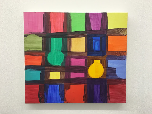
Babel rises….built brick by brick.  A new Babel in New York. In the spirit of the novel, each brick/canvas contains one of the letters that spell THETOWEROFBABEL, hidden in the real or imagined grid of New York, ‘fact’ and ‘fiction’ once again intermingled.  As I have mentioned before, what is exciting about this piece is the flexibility offered by the rearrangement of the bricks. Perhaps the new Babel will look more like the arrangement below, from this years Open Studios....

This painted tower was always intended as the centerpiece of the series, the finale, the idea was always lurking in the background. However, after a break of a few months there are new ideas and memories of half-explored ideas, unresolved. The ‘City of Glass’ series goes on….


SEPTEMBER 25

For greater clarity, I have given this piece different number 41, with each individual brick/canvas/letter numbered in sequence 42-56

APRIL 2

A very short session in the studio- one thought, one tool, one colour, one action, one line....the Tower is complete.  Looking forward to a day off with the family.

The extension of the line works for me, fading out towards the edge....I have really enjoyed making this piece- not least because it has forced me to work in the landscape format and on smaller canvases (25x30cms), where changes can be made very rapidly. While enjoying looking at the Tower, the downside is that each individual brick/letter/canvas is undervalued and hard to see. I think some of the paintings are as good as anything I have done, especially the later canvases so I am going to give each a City of Glass number to recognize their quality. It might take away a bit of the fun of working out the letters but perhaps they are obvious anyway....


City of Glass 56 - (T)

APRIL 1

Reflection: I'm seeing the painting in a different light- it's the New York canyon thing,...fiery sun... it's aerial view and image and a letter and the final brick..Now for the final arrangement...  

A long session in the studio, the Tower is one mark away from completion. The horizontal needs to extend further across the painting, almost to the right edge. It was there but the falling paint took it away.  A necessary subtle, subtle line to counteract all those verticals, a cut or the edge of a blade...


Small painting, big mess...


MARCH 31 p.m.

A looser, more flamboyant painting, I usually have Manhattan on the vertical, but this time I've using the natural 60 degree angle. It's undeniable - I must have been thinking about the terrific Mali Morris painting on Paul Behnke's recent post in Structure and Imagery. Thanks to you both!

Having a look again: leaving the gap between the 2 angled lines of the grid is critical, keeping it open, an entrance to the painting. It's done. 


City of Glass 55 - (A)


MARCH 31

When you look into the nothing what do you see?

I am just enjoying this painting as sensation, colour, peace, that beautiful central divide when i went back in with the colour. In terms of context, the painting is based on a 'real' district of New York, but there is the ambiguity to enjoy of what is water, what is land....

City of Glass 54 - (E)

MARCH 30 

I was seeing these colours in my sleep - in the studio at 5 this morning. Magenta+ Emerald Green + a bit of Hookers Green + White has made 'Lush Lilac' and an orangey Indian Yellow/Cadmium yellow mix. The single line de-flattens the space and offers an escape... two bricks/letters to go...

Went to Charlestown today, to escape from my cave. The Tower was still in my thoughts-  I was looking at mortar between the bricks of the harbour walls!. Love the reduction and the colour and the purity and the emptiness in this latest painting.


MARCH 29

City of Glass 53 - (O)


Q: When is a square not a square?   A: When it is a double-square

The excitement builds getting towards the completion of the Tower, hopefully by the end of the week.

'The building of the Tower became the obsessive , overriding passion of mankind, more important finally than life itself. Bricks became more precious than people. Women labourers did not even stop to give birth to their children; they secured the newborn in their aprons and went right on working' (P: 44, 'The New York Trilogy)     Quite!


MARCH 28

City of Glass 52 - (O)


Denise suggested the colour- scheme for the new 'brick' - pink and pale grey. Might tidy up the bottom and have the circle truly balanced on the line. The circle feels as if it might roll off to the right but maybe that brings a tension to the piece. Imperfect circles are best - Trevor Bell is the master. 


MARCH 26

City of Glass 51 - (W)

'Brick 10' has been a battle - I've just spent five hours in the studio trying stuff out, looking for a stronger, purer painting. I was bugged by being able to see the stretcher behind the paint on the left in (2) and needed to know whether the point of the triangle should touch the bottom of the canvas. I think (2) and the final painting work in different ways but I believe I've made a better painting. (2) is more decorative, busier, but the painting above has a strength in the drawing and the more intriguing space. I particularly like how the purple triangle sits on the line and its relationship with the pale-yellow corner.  The softer edges too against the severity of the scored lines. It's an uncompromising piece. 

The scored line was technically difficult- drawn by hand in one go with no room for error and because of the thickness of the paint, there is was a build up of excess paint around the sides which had to removed afterwards with a knife.  A pure freeing mark- if it went wrong I would have to remake a flat surface again, losing the unique combination of colours and marks underneath. 

Underneath? Where exactly is the line? The not knowing makes the painting interesting. 

The composition and the key elements have remained from the first session (1) The angled paint is critical as it mirrors the angled streets of the district. The purple triangle is a specific detail that cuts the horizontal of the street and of course the 'W' is one of the letters in THETOWEROFBABEL. Within these parameters I've made a painting.

I hope my daughter Faye likes it- she was upset when I started to make changes.  I like how the painting is, I think I can leave it. Like the building of the original Tower of Babel, this piece has become all obsessive - five 'bricks' to go. I have the locations for the remaining letters- lets see what happens. 


MARCH 25 

2

Possibly a new 'brick', maybe make the scratched angled line more precise. Found a new colour, Faye said it was one of those colours you can't name but she has come up with Kinda Cornish as it is a real sea-colour. Triangles (and letters) everywhere in this part of New York. 


1


MARCH 24


 I couldn't wait- I took off the blue paint with a knife allowing the underneath greens to come through. A vertical mark instead of a block of colour. I still need to straighten the edge. I've also taken out the scratched triangle at the bottom to allow the deep,deep violet to flood through the right side. A little bit of crisp drawing at the top of the column brings clarity and a suggestion of architecture....


City of Glass 50 - (T)


A good session- I've been  looking forward to introducing a dark 'brick' into the tower to shake things up. Might put a dark blue glaze over the column on the right to push it back into the painting at the same time simplifying the composition. Got to wait a few days 'til it's dry. I also want to straighten the edge- it was straight but the paint slid off!


MARCH 21-22

I like all three versions but particularly the whimsical feel of the final painting - the spinning wheel of the strange contraption held by the dark line. Just. Denise and Peggy (from Modern Artists Gallery) see a face...Although upright, it is also a 'real' location in New York...

Version 1 is very graphic but I felt the letter was too centered and too obvious. I do like the mysterious dark space though. Version 2 was nearly a contender- very sculptural, very still, pure and austere, but with too much downward movement.


City of Glass 49 - (R)


Version 2


Version 1


MARCH 17


City of Glass 48 - (E)


The version below was too static, the letter too blatant. The purple line, above, weighted at the bottom, the tiny-angled purple line, and some vertical brushstrokes have transformed this painting - it's much more complex and intriguing. 


MARCH 16

'Another brick (letter) in the wall....'


City of Glass 47 - (E)


'Another brick (letter) in the wall....'


City of Glass 46 - (L)

In the recent City of Glass paintings, the Tower of Babel, the central image from the novel*, has been neglected....In this piece, each small painting, 25x35cms,  becomes a brick in the Tower. In the spirit of the novel, each 'brick' will contain one of the fifteen letters that spell THETOWEROFBABEL, some obvious, some more obscure. 

Further exploring the blurrings of 'fact' and 'fiction' in the novel and in the series, some of the 'bricks' are based on the street-grid of Manhattan, others are pure invention - they could be part of the grid. It is for the viewer to become detective to make these discoveries....

Manhattan is dismantled, fragmented, rearranged. There is a discipline: if one of the paintings/bricks happens to sell, I am obliged to replace it, find another way to paint the missing letter. 

In this way the piece is renewed, kept fresh. I am looking forward to arranging the finished 'bricks'. Because of the infinite number of combinations, the piece need never appear the same twice. The 'new' Babel in New York may not be necessarily ziggurat-shaped....

This piece is for Geoff Rigden, who sadly passed away recently. Geoff taught me at Canterbury and set me on the road to becoming a painter, He often came to my Open Studios in London, and was very generous and perceptive in his comments about my work, opening my eyes to the possibilities in painting. Although, you don't normally associate 'image' with Geoff's painting, I hope that each individual panel contains something of the serious playfulness of his work. 

The 'bricks' below may change, though I hope by not too much. 


City of Glass 45 - (H)


City of Glass 44 - (F)

City of Glass 43 - (B)

City of Glass 42 - (B)


*'The New York Trilogy', a novel by Paul Auster


Monday, 4 April 2016

A Strange Occurrence - Two Artists, Two Continents....


'Shiro'   Paul Behnke   32x30ins  acrylic on canvas  2016


'City of Glass 55 - (A)'    Ashley Hanson   25x30cms  oil on canvas  2016

When I posted this painting on Facebook recently, as a 'brick' in my recent City of Glass 38- (T.H.E.T.O.W.E.R.O.F.B.A.B.E.L.)', there was A Strange Occurence. After posting,a split-second later appeared this painting by New York artist Paul Behnke. with the uncanny similarity of the triangles. A further co-incidence was that when I made my piece,  I'm sure I had been thinking about a Mali Morris painting that Paul had recently seen in Cuts, Shapes, Breaks and Scrapes, at Seventeen in London and posted on his Blog 'Structure and Imagery'


'And Ashbery'   Mali Morris   24x28cms   acylic on wood panel  2013

Seeing the paintings side by side made me think about our different approaches to painting and colour. In my work, I am happier with a context, my excursions into 'pure' abstraction proving to be a dead-end. The whole 'City of Glass' series is of course inspired by Paul Auster's novel 'The New York Trilogy' and in this painting the parameters were the the size and orientation of  the canvas, a possible connection to the grid of Manhattan, and a choice of 'T' or 'A', the two remaining letters. That is where my triangle came from but the context goes hand in hand with formal considerations during the process. 

I asked Paul about his triangle:

'For my part I'm not concerned with triangles as a form to work with. They come about more as a result of the process and a by product of the overall form I'm depicting. They are stylised elements within and part of that form'


I'm a great admirer of Paul's painting, the grandeur of their design and the scintillating colour.  Again with colour, we have different approaches. In my own work, I am puritanical about the importance of mixing colour, finding colour. I asked Paul about his colour: 'what does colour mean to you? purely formal and instinctive? did I read somewhere that you prefer not to mix colour?'

'Yes, generally I don't mix. only rarely when I need something quick that I can't buy. I think color is all of that even in the same painting. Parts of a form's color can seem formal but color has the capacity to convey an over all mood. Since I have no color choices in mind when I start a piece a color choice is a reaction to a color previously applied - just like painting in general - I make a move then react for or against that move’

With different philosophies behind our art, it is how we use colour that provides the link, its criticality to the piece, sensually and formally, and our searching for those magical colour- relationships, each colour leading to the next....


'City of Glass 38 - (T.H.E.T.O.W.E.R.O.F.B.A.B.E.L.)'  Ashley Hanson 125x150cms 2016


Appropriately, Paul's painting 'Shiro' is part of the IF COLOUR COULD KILL - New Painting from New York City exhibition, curated by Jeff Frederick, at the Salena Gallery, Long Island University, Brooklyn, New York which opens 5 April until 29 April:

'Abstract painting is a color delivery device. But when does color become dangerous, even homicidal? If Color Could Kill imagines a world better than the one we live in: one where color is power. The works of these eight painters say Yes in a way that is louder than everyday life. Modern pigments free the painter from the boring colors of nature. This is color too strong to be safely observed by the naked eye, color so intense it overwhelms and electrifies our fragile, vulnerable humanity'  


Paul's work can also be seen in 'Drishti: A Concentrated Gaze' at 1285 Avenue of the Americas Gallery, New York.  April 11 - July 1, 2016.

Monday, 8 June 2015

Private View to Ashley Hanson's Exhibition 12 June 2015

City of Glass 31- (A Study in Violet)
Over the last three weeks Ashley has moved his studio to Bodmin's Shire Hall Gallery and we would like to invite you to share a glass of wine with us and view the new work, alongside a wide selection of other paintings on Friday 12th June, from 6 - 8pm.


If you are unable to attend the PV but would like to see the exhibition , Ashley is working in the studio everyday this week up to and including Saturday 13th June. Ashley hopes to see you there.


Shire Hall Gallery
Bodmin Visitors Information Centre
Shire Hall 
Mount Folly Square
Bodmin 
PL31 2DQ
01208 76616

Opening Hours:
Mon - Fri  10am -  4pm 
Sat 10am - 5pm


Friday, 29 May 2015

'City of Glass 31- (A Study in Violet)'

'City of Glass 31 - (A Study in Violet)'    180x100cms

 
A reference/homage to 'A Study in Scarlet', the first Sherlock Holmes story - after all,  'City of Glass'* is a detective novel. The painting was originally worked as two canvases side by side, and planned as a much larger version of 'Celestial' with a less sweet blue/black sky. I had great problems dealing with the scale, lots of bitty areas, confusion.  After separation,  the colour-scheme was pared down,  the composition strengthened with the introduction of the violet/black stripe, an extended Central Park.  There are obvious connections with 'City of Glass 29- (The Space Between' and intriguing ambiguities. Is the violet stripe a sinister tower? A violet void - the entrance to the alley where 'detective' Quinn obsessively watches the entrance to the Stillman apartment? Love the play with the violet-black curves of Riverside Drive and the horizontal of 42nd St - in my eyes, the painting is exquisitely balanced. Perhaps because of the scale, the paint is less all-over heavy, with staining and transparent layerings bringing  areas of light to the piece.  


The main idea for my (unsuccessful) applications to the Pollack Krasner Foundation, Triangle Arts Association & the Tate St.Ives Residency, was to make a suite of paintings, each containing one of the letters that spell T.H.E.T.O.W.E.R.O.F.B.A.B.E.L. Maybe this is the first painting in that series within a series....(L).  Might need some funding though - these are substantial canvases! The concept still excites me, it is a piece I have to make, somehow, sometime. Because the 15 paintings will be arranged/hung with the greatest visual coherence, the letters will inevitably be all jumbled up, forcing the viewer, like Quinn, to discover the letters that spell T.H.E.T.O.W.E.R.O.F.B.A.B.E.L.


I am working in The Shire Hall Gallery at the Bodmin Visitors Centre for Open Studios, once again sharing a fantastic space with Janie M McDonald.  We are also both exhibiting a large selection of our work. Come see - we are there until 12 June.


 *from 'The New York Trilogy', a novel by Paul Auster


Sunday, 5 April 2015

'City of Glass 30 - (Celestial)' 100x80cms


DAY 5
 
The stars went in, an Alizarin glaze on the pink block, a couple of additional lines, tried and discarded, and it was done. This magical moment, when the painting says STOP! is unexplainable, intuitive, based on knowledge only up to a certain point because this is a new thing. Ideas, process, probing, testing, melt into pleasure, the senses.  
 
Familiar themes of the grids of architecture and the street interlocking, a building 'there but not there', now you see it , now you don't.  A rare sky, both inside and outside Grand Central station...fake sky, fake constellations, fact & fiction. The  curve of the sky is the new thing, echoed by curves within the painting. The stalagmite orange line pulsates, the proportion and arrangement of the rectangles feel right, glowing with colour, one with light. A window? I love the strength of the intersection of the long horizontal and vertical,(42nd St & Lexington Ave), almost making a painting within a painting but then not. The eye is led upwards. The familiar figure of Stillman from 'The New York Trilogy' * appeared at one point, two Stillmans, blue left, brown right: there are few traces, edited out, but they forced the issue and moved the painting forwards- this painting is about something else.


 DAY 4


Colour is happening and a more complex space. None of the usual colour horrors bringing it into the daylight. The dominant vertical that emerged - (Lexington Avenue) is on the Golden Section, as is the 'horizon' line. Over 30 years, I can't remember ever using these proportions deliberately/consciously, though I guess they have appeared. Together with the curve of the sky, the painting makes me think of ' The Baptism of Christ' by Piero della Francesca, with the weird hovering bird. Looking at the two paintings, there is also the strange co-incidence of the angled leg of the figure on the right and the diagonal in my painting- spooky, almost a reverse image.

The constellations/letters are going back in tomorrow and refinements adjustments of the verticals and horizontals.


Early days...the sky will be the deepest blue, letters hidden among the constellations in the vaulted ceiling of Grand Central Station....ghost avenues.....the 'scaffolding' of the streets still raw.. the dual carriageway of Park Avenue pointing to the heavens, also the radio tower atop a half-hidden building...

 * a novel by Paul Auster


Thursday, 22 January 2015

'The Fear & Thrill of the Chase'- Battersea Park Paintings


'In the Park'   165cms x 210cms

Having a look at these early, emotionally charged paintings again recently and seeing how they stand up over time, how strong they are, I feel now is the time to tell their story- especially because of the links/references to the Garden of Eden in my current 'City of Glass' series. Reflection: in each life there are many different lives - back then I was not yet fully formed as an artist or a person but this series - (painted between 1984-88) - gave a few more clues to who I was. There were many influences: the paintings of Edvard Munch, John Fowles's novel, 'The Magus' and music: Joni Mitchell's haunting 'Hejira' ' there is comfort in melancholy, no need to explain.....' and the title, 'The Fear & Thrill of the Chase' from 'Decades', the final track on 'Closer' by Joy Division.

'...here are the young men the weight on their shoulders.....'

I left Canterbury College of Art College in 1983, moving to London and sharing a flat in Battersea, near the park, with a close friend from college. The house next door was derelict and the top floor became my studio. It was Year Zero- time to start again- how much of what you make at college is truly yours? The first paintings- since destroyed- included the power station but it was the park that became the inspiration, providing the setting for the paintings.  The paintings are about an idyll, about friendship and desire, the inarticulate self, communicating emotions through paint.

'In the Park' (above) shows river & lake, a mixture of aerial-view and looking through trees. A group of friends in the top left, and another hidden figure behind the off-white shape that establishes the foreground. It is the same figure- the rear view of a man in an overcoat  - that appeared in my college paintings and re-emerged as 'Stillman' in 'City of Glass'.

'The Lake'    90x72cms

'The Lake', with the fiery willow tree, started off as a picture of a girl, the reddish bush in the background was the back of her head. (She reappears later). I still think this is my best ever depiction of weather and water. In parallel, there was a  painting of the lake that became a figure painting, sadly lost. 


'The Garden of Eden'     175x300cms

On the lake-edge I found a tree where a branch had been removed, leaving behind a perfect heart-shape.  This became the setting for a painting about love, despair, desire and deception.  What I took from 'The Magus' was the idea of the masque and the manipulations of reality and fantasy. Is the girl real or an ideal? - the statue/girl a devise for disguise. The motif of the yellow boat, scratched into the paint and surrounded by text, is taken from 'Melancholy' by Edvard Munch - in some versions it is called 'Jealousy'.......The heart-shape and the snake and the erection were all painted out - too obvious- leaving something raw, starker, bleaker- the message in the painting the enormous, empty space between the two figures.

The building reflected in the water is the pump-house, now a gallery, where we used to go late at night after a few pints. We also used to 'borrow' the boats and row out to the island.


'Southolm St, SW11'   30x20cms


The house on Southolm St was surrounded by railways and although the park was a few minutes walk away, I considered the railway-bridge/arch at the end of the street as a gateway, an entrance….. The upside-down arch became a motif, a reflection in the lake.  The figure is probably myself, the house wasn’t pink and there was no tree.


'The Girl'   180x60cms


The bleakness of the ‘Garden of Eden’ was followed by a triptych of near life-size figures, boy on the left, girl, on the right and in the centre an embrace. All that remains is the painting of the girl and the face of the boy-figure, transformed into ‘The Tree’. 
‘The Girl’ was originally called ‘The Awkwardness of Nakedness or The Look That Destroys Men’. Reality and fiction intertwined again, another John Fowles connection, this time a look that Sarah (Meryl Streep) gives to Charles (Jeremy Irons) in the film of ‘The French Lieutenant’s Woman’.
It is has been cathartic, looking back on these works and my life, as it was, contained within them.


'The Island'   60x90cms


'The Tree'    30x20cms

In the studio