Friday, 26 February 2016

City of Glass 39 - (Prophecy)


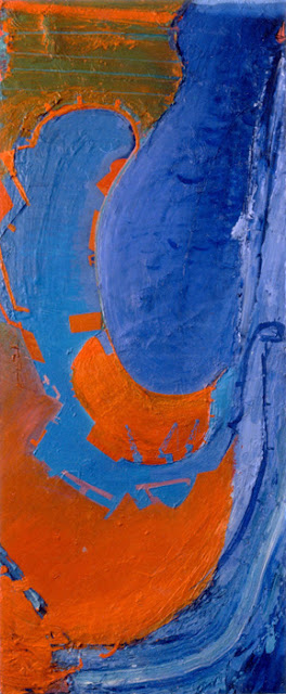
'City of Glass 41 - (Prophecy)'  60x30cms

It's taken a while but we have a new title....

MONDAY
A few new touches that seem that seem to make the painting stronger. The orange line lifts the eye to the top of the painting: there was a nagging suspicion that the tower had to be higher - no need for that now. The orange line slightly squeezes the space between the top of the painting and the head and draws attention away from the head which I think works. I've also tidied up the top of the tower making it sharper, stronger and the paint around the bottom left of the overcoat which was getting a bit murky. Touch of orange in the brown too. Fiddled a bit with the hand that looks like a club in image below! The title still not definite..I may know more when I've finished the second one..

SATURDAY PM
I took out a heavy brushmark from the bottom left of the coat and refined the shape of the tower by carving out the 'ziggurat' steps at the top. Much stronger now...there are traces, residues, marks of interest within the tower, not sure there is any need for the island....might have to change the title, perhaps 'Obsession' Thinking about putting thin horizontal band on the top edge to squeeze the space with the top of the head and also lift the tower. Or put in a spire/radio tower cutting thru the collar..we'll see...


'City of Glass 39 - (Prophecy)'   60x30cms


SATURDAY AM
I couldn't wait..the reveal...odd, exciting....just dealing with it at the moment... might take out the heavy outline, lose the figure a little or lose the blue or the figure entirely then re-draw the figure inside the tower...


FRIDAY
Stronger drawing- love the curve of the back- and better browns that are starting to do something with the blues. Denise and I are missing the grey. I've run out of quick-dry medium so shall have to wait longer before the tower is removed. I have a same size canvas- lets do another one. This is quite a small piece- 60x30cms- perhaps i need to do one life-size...the purity of the early version (1) is still my favourite..


3


THURS
The 'City of Glass' series*, is dominated by three elements:the Tower of Babel, the island-shape of Manhattan and the figure of Stillman. Several of the paintings include two of the three elements, the idea behind this piece is to include all three. 

I started off with a straightforward representation of the familiar motif of Stillman. I was thinking about the sequence of 'Weeping Woman' paintings in the Edvard Munch exhibition at Tate Modern a couple of years ago, with the bowed head almost crushed by the low ceiling. Its' literalness was disrupted by smudge and disguise and a pour of blue and then by the introduction of the tower, made from wooden strips. A beautiful grey.

Then the figure of Stillman was re-introduced (2) - apologies for the brown, it's just Pollyfilla, building up the bulk of Stillman as I work out the composition. The painting tries to replicate the claustrophobia of the Munch paintings, the figure trapped by the four sides of the canvas. The plan, reviving a past process, is to remove the tower at some future point, to leave behind it's negative shape, seemingly carved out of the back of Stillman. Then we can work on the island-shape of Manhattan within that outline. Time to work.

2


1

'Weeping Woman'  Edvard Munch

*inspired by 'The New York Trilogy', a novel by Paul Auster


Friday, 19 February 2016

'Barcelona' , 'San Diego', 'Aircraft over Aberdeen'

 Three large harbour paintings from the 90's, a place can be defined by its' shape...


'Barcelona'  180x140cms

'Aircraft over Aberdeen'   180x120cms

'San Diego'  180 x 100cms


I really liked San Diego spending a week there on my travels. The orientation is switched so that north is at the top of the painting, the angled line is the Mexican border.  It is a painting of curves with the man-made elements picked out in tuned-up colours and straight lines and angles.  In the detail below I love the interplay and repeated motif of the cranes and the harbour-arms, aerial-view and image in harmony. 


Monday, 25 January 2016

In Progress: 'City of Glass 36 - (The Force of Chance)'

In progress - 'City of Glass 36 - (The Force of Chance)'  120x100cms

Time to look at this again now the paint is dry. It's not enough but it's exciting. The title came to me in my sleep, or lack of. There is deliberation and control in the selection of colours, the liquidity/consistency of the paint, the placement and concentration of the drips, (to establish the avenues of Manhattan), but how the drips run, how they behave, is down to chance.

The exploration and manipulation of chance is at the core of Paul Auster's story 'City of Glass'* which inspired the series.

This is a beautiful painting, but a drip is a drip and I see connections in the language to the work of Jackson Pollack, Ian Davenport, Bridget Riley. If I choose to take the painting further, it will inevitably go backwards before going forwards, but this decision, this risk, is what painting is about: it there are any questions, any doubts one must take the plunge into the unknown.

*from 'The New York Trilogy'

Sunday, 24 January 2016

'City of Glass 35 - (Village Green)'

'City of Glass 34 - Village Green)'   70x70cms

1 OCTOBER 16

Close!    'Selected Not Hung' at the RWA Open in Bristol. New images below of work in progress, from the 'illustration' of the harbour in Porthleven into a painting


24 JANUARY 16

4.30 p.m.

More clarity by extending pink border/frame to top corner. Is this it?

2 p,m.

I think I'm there. I am enjoying the reworked shapes and the warmer colours that were introduced- the earlier version below felt too crude, the palette cold, cold, cold. There is an in-and-outness about the grid that I like- sometimes linear and forward, other times 'shape' and locked, with colour creating the space. The rectangle of Washington Square is now strong, tucked amongst the pinks in the bottom right corner. The green is based a Michael Harding paint, Bright Green Lake- beware! The top section is indulgence - I enjoyed making this mark. The gestural paint and blue slash continues the movement of the fast pink marks on the right around the canvas, helping isolate the painting within a painting, the large shape of the grid. 

Denise wasn't sure about the painting, thinking it too complicated, and suggested taking out the line of 8th Ave, below 23rdSt. It's made a great difference, opening up the painting and revealing the green semi-circle more. The different thing about this painting? Not a single drip.

Quinn's walk from the novel is there*: initially a strong dotted line, I've gone for subtle. There is a trace if you know where to look (see description below)

'Village Green' is quintessentially English: do New Yorkers use the phrase?


This much worked canvas has had many lives but never gained priority or favour. A sparse, abstract demonstration painting from the Portheven workshop tentatively became a painting about Porthleven itself before becoming an enjoyment of colour, shape and paint, with that first exercise providing the palette. 

To be honest I didn't know what to do with it but seeing it on the wall after a break of a few weeks, with fresh eyes, I immediately  hooked onto the pink triangle, my entry into the latest City of Glass painting. It is the 'Chelsea Triangle', formed by 24th St, and 11th and 12th Aves which I seem to have highlighted in many of the paintings in the series. My first thought was to balance the triangle with the green rectangle of Washington Square in the bottom right corner, hence the title. I'll have to fix the shape and make it a powerful green to take attention away from the pink triangle, still, in my eyes, the dominant element in the painting. 

I like how the quadrilateral sits within the square, with faster marks and movement around. Organic shapes undermine the severity of the grid and the less-disciplined streets below 14thSt gives scope for angles, zigzags, real and fictitious, giving more movement.

Washington Square features in the novel, part of Quinn's meticulously described walk on pages 106-112. ...down 5th Ave to the Flatiron Building, west along 23rdSt, left down 7th Ave to Sheridan Square, then along Waverley place to Washington Square. 

Quinn's walk will be plotted on the painting- it has to be there, it just a question of how strong or subtle it has to be in terms of the painting. 

Here we go. 


*'The New York Trilogy' by Paul Auster


Friday, 15 January 2016

City of Glass 34 - (Watch that man...)

'City of Glass 34 - (Watch that man...)   120x100cms

THURS 21 JAN

I have redrawn the left-side of face again & also added a very subtle line of the chin. There is a definite twist to the face now, less flat. I am enjoying the composition - how the West Side follows the angle of the face and how the bulge of Chelsea is echoed by the left ear. Two more City of Glass paintings on the go now, one I started a while ago, the other with the working title 'Village Green'. Watch this space.

SAT 16 JAN

A few subtle changes to the Bowie outline- it now seems more varied, more interesting and truer to the image. I also added a couple of small piers on the West Side to disrupt the verticals. Listening to Young Americans. The intersection of 5th Ave and 14th St is very powerful, an unintended piece of symbolism. This painting is right on the edge.

FRI 15 JAN

A tribute to David Bowie, a hero...the iconic outline of Aladdin Sane becomes the framing rivers of Manhattan. The outline is not quite right, it's a little crude,a little obvious. I may re-draw tomorrow.Or not.

Choosing the title for the piece was very difficult but critical- some were obvious, others more subtle: 'Hero', 'Starman', '285 Lafayette St',  '(1913-1938-197?)', 'Millions weep a fountain..'. 

I've gone for 'Watch that man...' with it's dual reference: we were all watching Bowie, wondering what he would do next.

The novel 'City of Glass'* is all about watching that man...

'Watch That Man' is, of course, the opening track of Aladdin Sane..

Emotion, image, place, ambiguity..no-one was more ambiguous than David Bowie. 'Ambiguous' comes a close second as a title...


285 Lafayette St


* from 'The New York Trilogy' by Paul Auster


Saturday, 9 January 2016

'RED' Workshop, Canterbury Dec 2015


Red is passion, courage, revolution, luck, blood, sin, fire…..

It is scarlet, cadmium, crimson, pink, burgundy, red earth…..

Red gets noticed….


A very challenging and enjoyable two-day workshop at Canterbury Christchurch University.  Red means something different for each of us-  I'll let the paintings speak for themselves....


Estelle Jourd


Antonia Glynne-Jones

Philippa Langton


Heather Rachel Johnston


Nicola Waters


Robin Thompson


Aiden Flood


David Carnegie


Jo Rollnick


Mitzi Delnevo

Catriona Campbell

Jo Dunlop

Heather Rachel Johnston


Jo Rollnick


In the Studio

Colour studies


In the studio


There was another artist, Kathleen Alberter but unfortunately we don't have an image of her striking painting. Watch this space.


Here are a few comments from the artists about the Workshop:

'Really thought-provoking'     David Carnegie

'Well prepared. Very positive and helpful guidance'    Robin Thompson

'The individual comments on my work were really useful and insightful...Ashley's passion for art was unflagging and fed through to everyone'     Aiden Flood


Sunday, 6 December 2015

'Sunset Ltd' & 'Crescent'


'Sunset Ltd'   120x120cms


The third and fourth paintings in the Amtrak series, showing the journeys from Los Angeles to New Orleans and then back to New York.  

As well as referencing my travels, 'Sunset Ltd' was also driven by the challenge of making a circle work in the centre of a square. Before this piece I had had a rare commission where part of the brief was to place a sun in the centre of the painting.  I struggled with this and moved the sun slightly towards the bottom edge, breaking the perfection. 

in a way,I felt I had avoided the challenge so I made an identical 120cms square canvas and screwed down in the centre a circular piece of wood that had been hanging around in the studio for years. The idea didn't come until a few weeks later when i read 'Sunset Ltd' by James Lee Burke where New Orleans and the train-line feature. 

The expressive brushwork of the oceans spins around the still centre, flamboyant shapes continue the movement across Canada. Desert colours, the Great Lakes like palm trees. Within the plateau of the circle is the image of a sun setting behind a mesa, which also reads as the Texas Panhandle....map-truth and painting truth, plan-view and frontal view,  once again intertwine.


'Crescent' below shows the last leg of my journey from New Orleans to New York. It is a strange piece, sweet colours, the pale-blue hints of sky and I see the image of a horse.